Emme
Branding

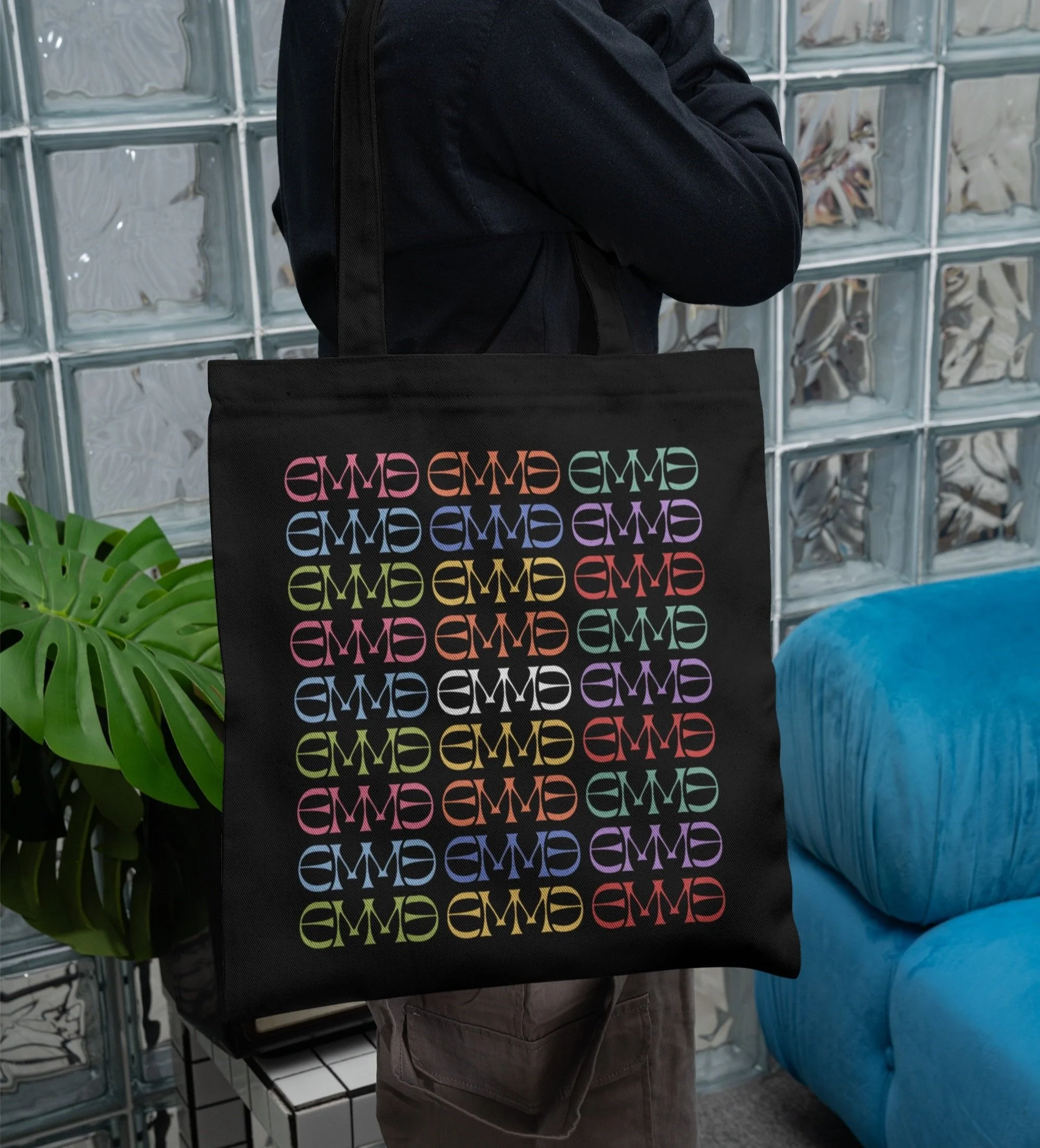
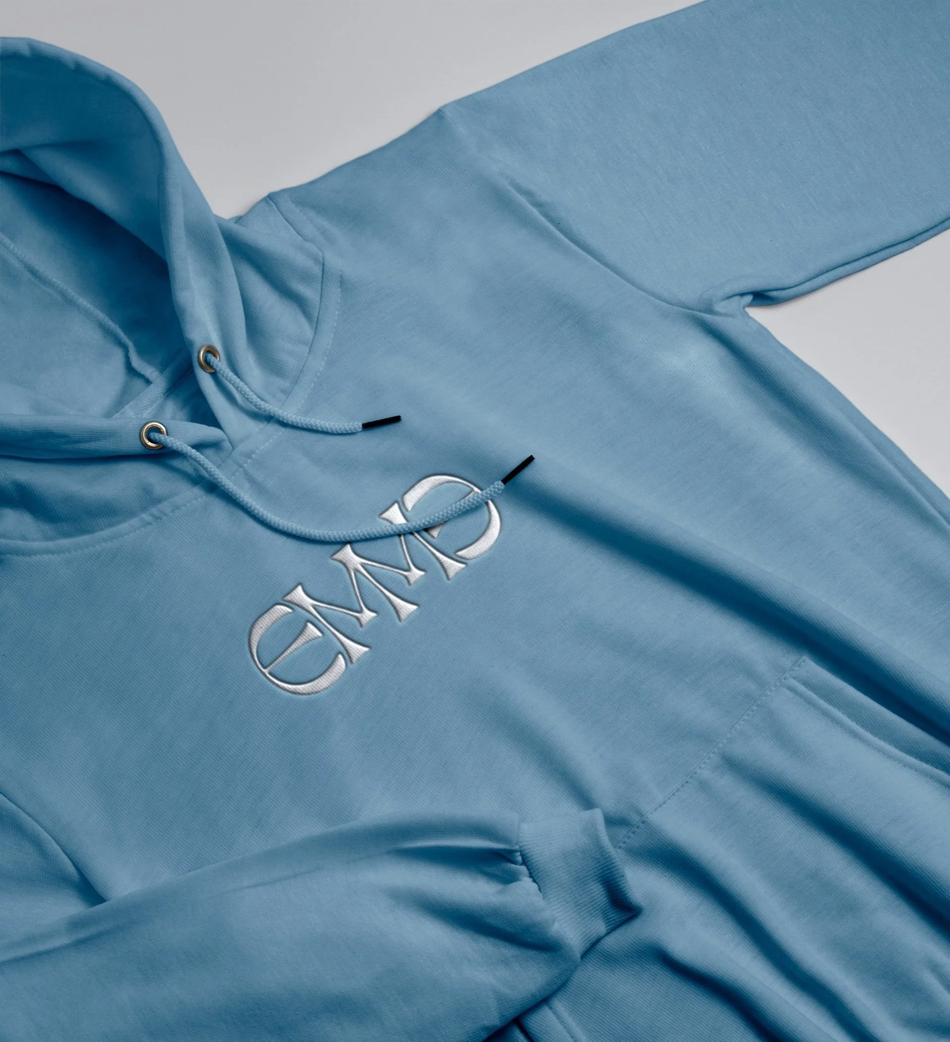
I designed this logo and branding for Emme, a singer whose music embodies the soulful, nostalgic essence of the 1960s. Inspired by the era’s bold typography and expressive letterforms, I created a custom logotype that balances vintage charm with a modern edge. The mirrored, symmetrical structure of the letters reflects both harmony and individuality—qualities that define Emme’s sound. The warm, retro-inspired color palette further reinforces the timeless feel, making the identity as distinctive and memorable as her music.

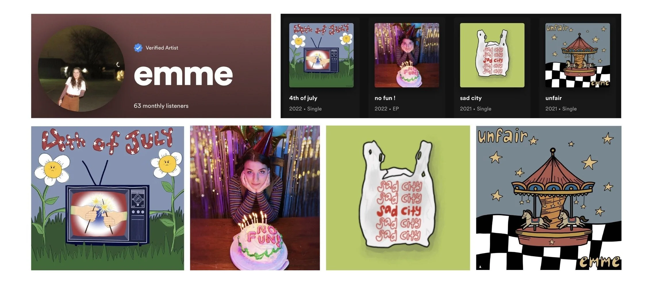
I began by analyzing Emme’s existing single and EP covers to understand her visual identity so far and identify a new direction for her brand. While her past designs featured a lot of illustration, there wasn’t a cohesive visual system in place. This logo became the foundation for establishing a distinct and consistent brand identity, giving her a strong visual presence to build upon as an artist.

I love starting a project with a mood board to define the aesthetic, style, and overall direction of the design. For Emme’s branding, I knew her music and stage presence had a strong 1960s influence, which felt like the perfect reference for her logo. To capture that essence, I researched the era’s logos, typography, color palettes, fashion, patterns, and illustration styles, ensuring the design reflected both her sound and artistic identity.

From the start, I knew this needed to be a wordmark—something clear and readable while still capturing Emme’s unique identity. I explored various typefaces, searching for the perfect foundation that balanced vintage inspiration with a modern edge. After narrowing it down to a few options, I selected one and refined it into a distinctive, custom mark.